
Balancing Proportions: Advanced Interior Design with Indoor Plants
Believe it or not, people aren’t usually born with incredible decorating skills—the best interior designs follow basic principles and rules. When you’re trying to figure out how to arrange your plants, knowing these basic guidelines will make things so much easier!
Learn These Interior Design Principles To Create Flawless Indoor Plant Displays
Got a whole gaggle of indoor plants and have no idea how to integrate them into your interior design? It’s all good—you have to begin somewhere! Let’s start at square one.

The Golden Ratio
For literally thousands of years, the golden ratio principle has been used to create visually appealing designs. It goes as follows: the scale ratio of a smaller component to a bigger component should be the same as the scale of the larger component to the display as a whole. For example, if you cluster together three plants—one four inches tall, one six inches tall, and one nine inches tall—the three different plants will look perfectly proportioned together.

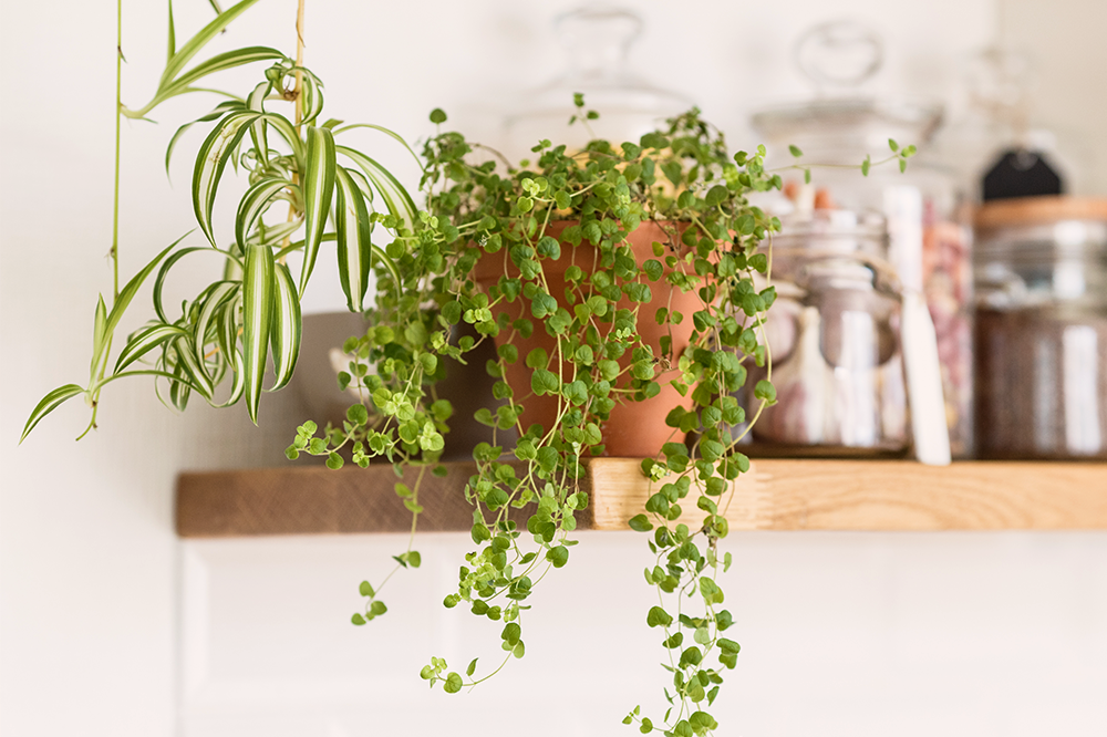
The Rule of Threes
Three is a number that works well with design! This doesn’t just apply to grouping together three different plants, as illustrated in the previous example (though that is a pretty good go-to method). The “rule of threes” also applies to how you arrange your layout. Imagine two invisible lines dividing a shelf into perfect thirds. For a minimalist look, arrange your plants to fill up one-third of the space on the shelf. Fill two-thirds of the shelf with plants if you want even more greenery but want to avoid it looking cluttered.
Achieve Harmony With Balanced Color and Texture
With indoor plant design, your color scheme applies to your plants and their pots! Too much of the same thing is boring, and too much contrast looks busy and can be visually overstimulating. The best way to achieve a sense of harmony with interior design is by creating a simple yet striking color scheme and considering the golden ratio when pairing textural accents together.

If coordinating colors isn’t your strong suit, there are lots of simple formulas you can follow, or you can use an online color palette generator. It helps to start by choosing a warm or cool palette—ask yourself if you want more warm golden tones or cool blue or silver tones in your design. Keep this color “temperature” in mind when picking your pots and plants. Pair warm-toned plants together, like Golden Pothos and Croton Petra, and cool-toned plants together, like Peperomia Frost and Calathea Ornata.
Pick three or four colors to fit within your design to help you choose containers that look nice together. Try choosing one neutral base color, one complementary color with a bit more “oomph,” and one bright accent color or a fun pattern to use in small pops. Here are a few examples of indoor plant color palette ideas:
- One large ivory planter, a medium metallic gold pot, and a small pink patterned pot.
- One large concrete grey planter, a medium navy blue pot, and a small teal green pot.
- One large brown wooden planter, one medium burgundy red pot, and one small purple pot.
Achieving a balance of textures amongst your indoor plant collection will also contribute to an attractive interior design. For example, if you have several plants with smooth, flat leaves like Dieffenbachia and Ctenathe Lubbersiana, then you’ll want to add some plants with contrasting textures to switch things up a bit. Try something with shaggy, frilled foliage like a Cotton Candy Fern or with long, skinny blades like the Spider Plant.
Adding variegated plants is another way to play around with texture. If most of your plants have solid green leaves, try adding plants with colored stripes or speckles. White and silver variegated plants are super trendy right now!
Symmetry vs. Asymmetry
When you’re figuring out your layout, your instinct might be to space everything out perfectly symmetrically, but this might not fit the overall vibe of your space! Here are some key differences between symmetry and asymmetry to help you make the right layout choices.

Symmetry looks more formal and grand, so it tends to suit dining rooms, big foyers with ornate furnishings, and more fancy decor styles. While some folks appreciate this style, others may think it feels a bit stiff and hotel-like. If you’ve got a creative, eclectic style in your living room or kitchen, then arranging your furnishings in a symmetric way might not look quite right.
Asymmetry, when done strategically, can look quite attractive, but more informal. It has a more youthful, carefree energy that suits living rooms and sunrooms. To make sure your asymmetric design doesn’t look sloppy or cobbled together, keep the Golden Ratio and the Rule of Threes in mind!
Feeling ready to pull together an amazing interior design with your own indoor plant display? Our full catalog of houseplants is constantly being updated with gorgeous new varieties! Browse today to see what’s available now for quick, convenient home delivery.
